Narrowed Down Choices
I have been on the search for the perfect wedding website: one that looks good while providing the best information to our guests. My masters degree is in web design so I am a fairly fussy customer when it comes to wedding websites.
I have narrowed down my choices to the following:
| Project Wedding.com | My Wedding.com |
 |  |
| Big Day Page.com | Getting Married.co.uk |
 |  |
| Wedding Announcer.com | Wedding Path.co.uk |
 |  |
You may notice that all these websites are in fact pink. Well, lilac is one of our wedding colours and not many wedding websites are in lilac. That surprises me really because a lot of the suppliers I spoke to told me that lilac was a popular wedding colour.
Choosing a website is a really tough choice as all the different sites offer different designs and functionality.
Wedding Announcer.com
Why I’d Choose Wedding Announcer.com
Wedding Announcer is a very simple website which makes it marginally easier to use for people who aren’t web savvy.
The behind the scenes part of the website has clear boxes for information to be entered into and there’s not much fuss.
Why I Wouldn’t Choose Wedding Announcer.com
The designs could be considered slightly dated, there’s no option to add links or maps from googlemaps or other sites, and I’m not too keen on the designs.
While ease of use is important, it shouldn’t detract from the over all functionality of the site. It has to work as a website that provides information to your guests.
Getting Married.co.uk
Why I’d Choose Getting Married.co.uk 
If you are web savvy, the coding options on Getting Married.co.uk are fantastic. You can insert html and insert pictures or maps from sources like googlemaps. You can add as many new pages as you want and rename them to the titles of your choice.
If you’re not web savvy, you can still use the site as it works perfectly well as a simple site. It just has the option to include the more advanced features to those who know how to use them.
You edit the site in the site, as it were, so you can see exactly how your changes will look. The yellow highlighted text in this picture shows the editable text on the page.
Why I Wouldn’t Choose Getting Married.co.uk
I really don’t like the designs. I’m after a balance between the functions and the design. Getting Married.co.uk have a lot of different website designs, but to me I feel they are a bit dated and not really as sleek as some of the designs out there. Which is a shame because they have some good ideas tech side.
Big Day Page.com
Why I’d Choose Big Day Page.com
It’s very simple, not easy to break and very straight forward. For those out there who aren’t sure about websites or editing, this is the website for you!
Why I Wouldn’t Choose Big Day Page.com
There’s no room for making the page unique, no adding extra pages that suit you and your guests. It’s too uniform, and to be honest, I’m not too keen on the website designs.
My Top Three
I’m going to have to find some way to choose between theses three websites (in no particular order):
Project Wedding.com
Why I’d Choose Project Wedding.com 
Project Wedding.com has the option of using a html editor so that if you want to embed items such as a map or a video from you tube, these things are possible.
The designs are quite nice, not completely to my taste but they are nice. You can add and delete pages and change the names of the template pages. It seems as if you can have as many pages as you’d like.
It is perfectly possible to remove any of the preset items added into the website, or rename them as you see fit.
It’s a straight forward website for those who are not tech savvy, it has the option of adding extras for those of us who know how and the designs are fairly nice.
Why I Wouldn’t Choose Project Wedding.com
For me, it’s just the designs that would prevent me from using Project Wedding.com. They are nice, but maybe there are better.
Wedding Path.co.uk
Why I’d Choose Wedding Path.co.uk
It’s British! Not always the best reason for choosing something, but there none the less. I think you have to be invited to have a website with Wedding Path now, however I’m sure that’s just done by sending them an email or registering. I set up my website almost straight after we got engaged (October 2009) so I had one before the ‘invitedness’ started.
I like the designs on Wedding Path.co.uk. They have animated headers and nice bright colours. Again, the number of designs is limited but the ones they have are nice, up to date and modern.
Again, like Project Wedding.com it’s possible to insert html, which is always useful.
Why I Wouldn’t Choose Wedding Path.co.uk
It’s a little trickier than with Project Wedding.com because it doesn’t have an embedded html editor, you actually have to type all the code yourself. But again, if you’re not into editing code, you wouldn’t use that anyway.
My Wedding.com
Why I’d Choose My Wedding.com
I did like the majority of the designs. They have a fairly cool scheme called ‘Spring Wedding’ but it’s in green and blue and my wedding is lilac and pink so it doesn’t really fit with all the stationary.
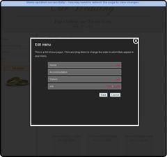
The behind the scenes part of the website is absolutely fool proof, step by step, so easy even my mum could use it! You can edit the names of the pages, change the order they appear on the menu and turn off or on certain pages.
There are 6 custom pages, pages you can change and edit yourself to make how you want. There are also a number of template pages that are set up for you, like a photo gallery, wedding party details, RSVP and things for your guests to do in your area.
Why I Wouldn’t Choose My Wedding.com
Embedding html in a page is important for me; I don’t just want the links to a map, I want to include the map with directions in the webpage. As far as I can tell, it’s not possible to add html to the pages at My Wedding.com.
If I Were You..
For the Web Savvy
I would go with Wedding Path.co.uk or Project Wedding. I have looked at the website designs on both sites and just chosen the one that fits most with our wedding and uses the same colours. Both of these websites also supply wedding stationary that matches the website, so you could have it all coordinated and looking lovely if you wanted.
For the Web Surfers
I would choose My Wedding.com. They have lovely designs and a very easy method for entering your information.
Good luck!


